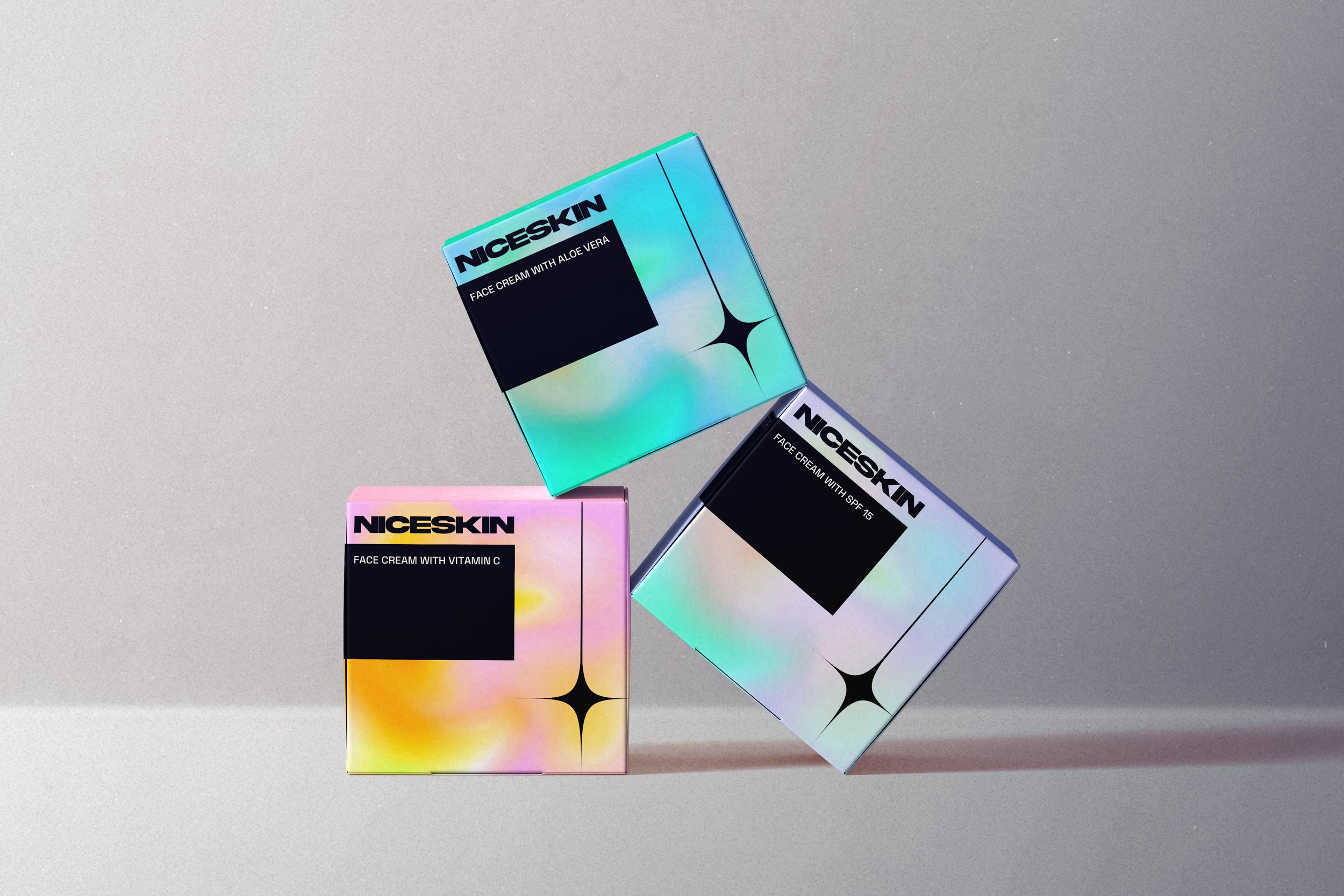
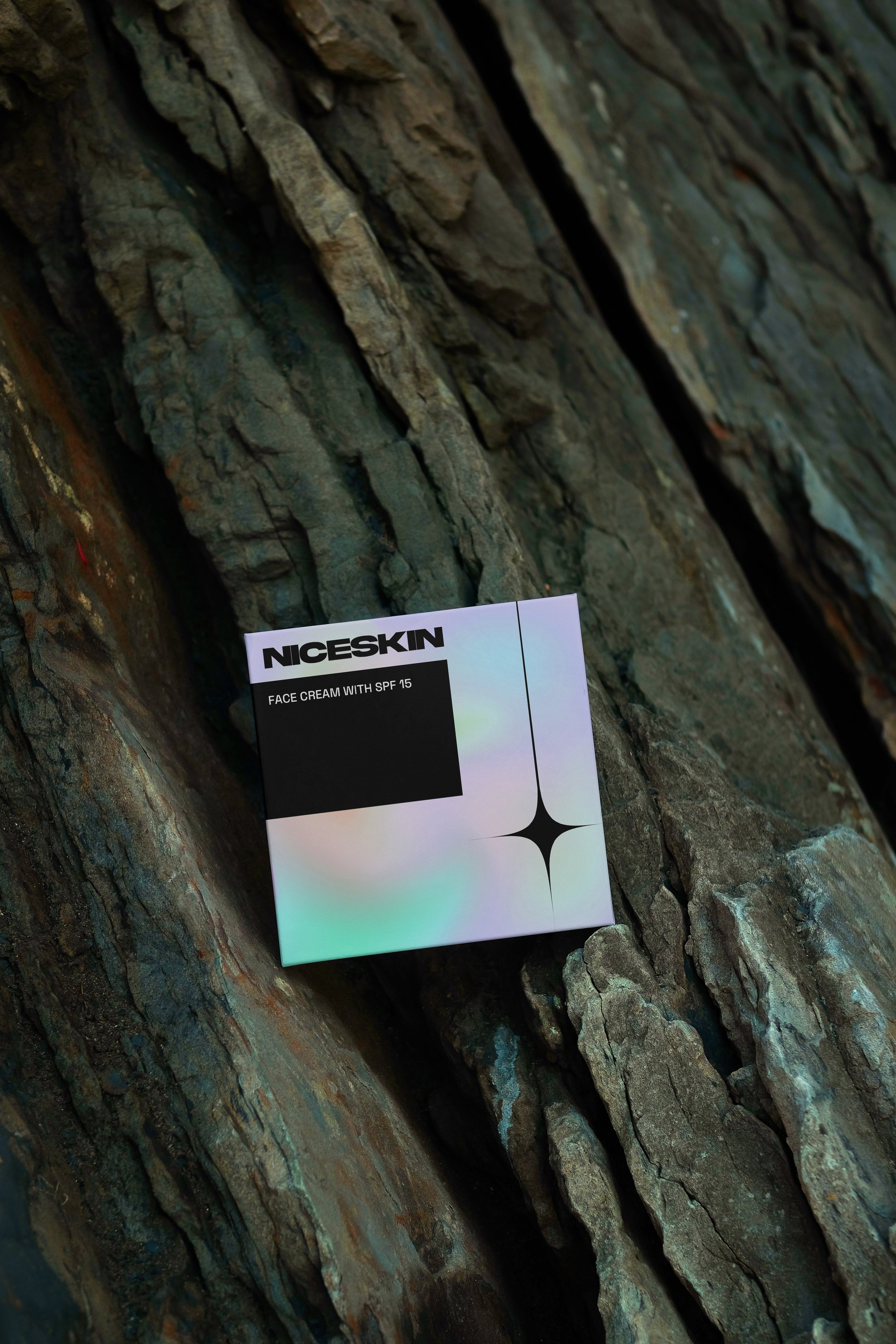
NICESKIN needed some box packaging for a variety of face creams.
They wanted a universal design, in line with their trendy brand guidelines, but to include a variation of colour gradients for the different creams, Aloe Vera, SPF 15 and Vitamin C. The logo is a simple extended bold typeface, so they were quite happy to get interesting with the incorporating colours, as they didn’t feel this would necessarily take away from their logo and branding.
*this project is from a design brief.
NICESKIN
Packaging