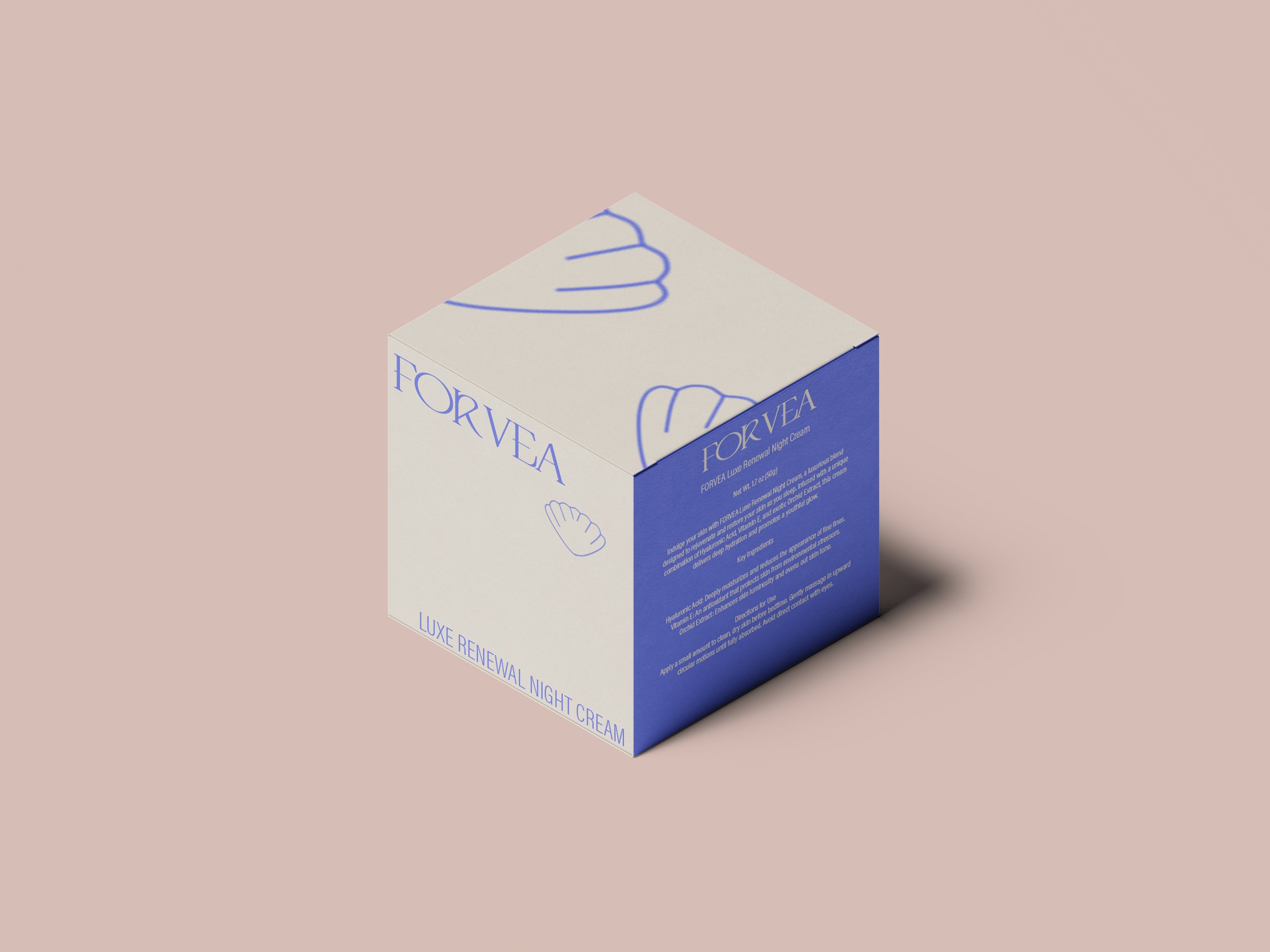
FORVEA were looking for a nautical style branded look, and wanted to start a packaging idea for their night cream. They wanted a sea shell incorporated into their branding, perhaps as a secondary logo.
The look for the packaging was quite clean and minimal, but bringing in some nautical colours like a royal blue. They wanted a more premium feel to the box packaging, including a serif font, that gave their brand name a classy feel, but also a little bit retro.
*this project is from a design brief.
FORVEA
Packaging